
By Timon Rowntree | January 2026
Heatmaps - Visualising Mini-Grid Portfolio Performance
Solar mini-grids have become one of the primary solutions for expanding electricity access in unconnected rural areas of Sub-Saharan Africa (SSA) and other emerging markets. Today, a variety of developers construct and operate mini-grids, and the metrics to take the pulse of their portfolios are largely agreed upon across the sector. Indicators such as the number of active customers, energy consumption and average consumption per user (ACPU), revenue and average revenue per user (ARPU), technical and non-technical losses, and system uptime form a common language for stakeholders in the energy access sector.
In contrast to the broad consensus on which metrics matter, less attention is paid to how these metrics are visualised - both internally for the benefit of operational teams, as well as externally for investors, regulatory bodies and governments. Insights from behavioural science, however, show that the way information is presented has a significant impact on how it is perceived and, ultimately, how people act. Ineffectively designed visualisations can cause confusion, misunderstanding, or even distrust - especially among viewers with low graphical literacy [1]. Given the importance of portfolio performance in building viable distributed energy businesses, and the fact that resources for the operations & maintenance (O&M) of assets are finite, might we seek improvements in operational effectiveness by simply visualising existing data differently? And, how do we design these visualisations to be actionable for everyone, from senior stakeholders to users with lower graphical literacy levels?
The Current State of Operational Data Visualisation for Mini-Grids
To answer those questions, let’s take a look at the way mini-grid data is visualised today. Though there are many operators out there, each with their own unique platforms and visualisations, there are some common views. Three examples are shown below.
Example 1 – Portfolio aggregates of typical metrics
A popular component in operator platforms tends to be portfolio aggregates. It shows the total or average of a metric, for example the active customers, energy consumption, or ARPU in one single number. It often appears on user interfaces (UIs) as shown in Figure 1.
Figure 1: Portfolio aggregates for a number of typical metrics - active customers, energy consumption, and ARPU.
They offer a simple, high-level snapshot of the current status of the portfolio, or a portfolio segment. While this provides some basic insight, a view like this alone makes it hard to determine whether the performance shown is good, poor, or something in between. Even less so, it is a pointer for action. For more granular insights, operators tend to break things down by mini-grid site - see the next example.Example 2 – Comparisons between Mini-Grids
Rather than presenting a single number, creating a bar graph that shows mini-grid sites side-by-side gives more insight. See Figure 2 below.
Figure 2: Bar chart showing mini-grid energy consumption (in kWh/day), as well as a percentage change with respect to a previous timeframe (for example a day, week, or month).
This view, however, also has its limitations. Although it clarifies differences between sites and gives a rough indication of performance changes compared to a previous data point (the percentages shown above the bars), it is still difficult to understand what is going on in the portfolio. Take mini-grid MG-04 for example; if a metric such as energy consumption has averaged X this week, and is 15% higher than last week, that could still mean a variety of things. It could be that last week’s consumption was below expectation; it could mean this weeks consumption is particularly strong; it could be that the site underperformed in both weeks - or that, in fact, performance has been perfectly normal throughout. The breakdown by mini-grid definitely helps uncover some dynamics, but it is not yet a highly actionable visualisation that shows where to send operational resources.Example 3 – Dynamics Within Mini-Grids
To gain further insight on the performance of a site over time, operators can plot a simple graph over time. An example for the energy consumption metric is shown below in Figure 3.
Figure 3: Line chart showing MG-01 energy consumption over time.
This is a useful graph to better understand the dynamics within a site. We can see whether the metric is at a high or low point relative to other timestamps. Crucially, however, we have lost the comparison with the other grids in the portfolio. If a graph like Figure 3 shows a moderate drop in energy consumption - potentially signaling the need for O&M action - it doesn’t immediately reveal whether other parts of the portfolio might need even more urgent attention (for example, if two other grids went offline).
Of course, one could plot multiple sites together in one graph, or navigate to this same graph for the next mini-grid, but that’s not an approach which works at scale. Mini-grid developers could have hundreds of sites under management. For scale, we need data visualisations that are actionable at a glance.
The crux of the matter is the following; effective priortisation of O&M issues cannot be done without the inter-grid comparisons, but we need to keep the picture over time to put the data into its context. The example of the bar graph in Figure 2 gives the inter-grid comparison, but not the time trend; the chart in Figure 3 gives the time trend, but not the comparison.
Introducing Heatmaps for Actionable Mini-Grid Insights
Heatmaps are a reorganised view of the data that teams are looking at already. They build on the time-averaging of metrics and show performance differences both within and between mini-grid sites in a single view.
They can be made for any metric - energy consumption, ACPU, ARPU and so on - provided the data is available to the operator (which can be a challenge in its own right). The objective is to create a visualisation that conveys, at a glance, the information needed to guide effective action. It should make it immediately clear to operational teams where attention and resources are most urgently across the portfolio of assets.
Example 1 - Heatmap for Energy Consumption
Figure 4 shows an example heatmap for energy consumption of a hypothetical portfolio of 15 mini-grids with some dummy data. Each cell shows the average value of the metric over the past week for a given mini-grid (rows) at a specific point in time (columns). In this case, it shows the average daily energy consumption (kWh/day) for the week in question. The time-resolution can be adjusted to suit the operator’s needs – this example uses weekly averages, but daily or monthly columns could work too. More recent dates are shown towards the left of the map, older ones to the right.
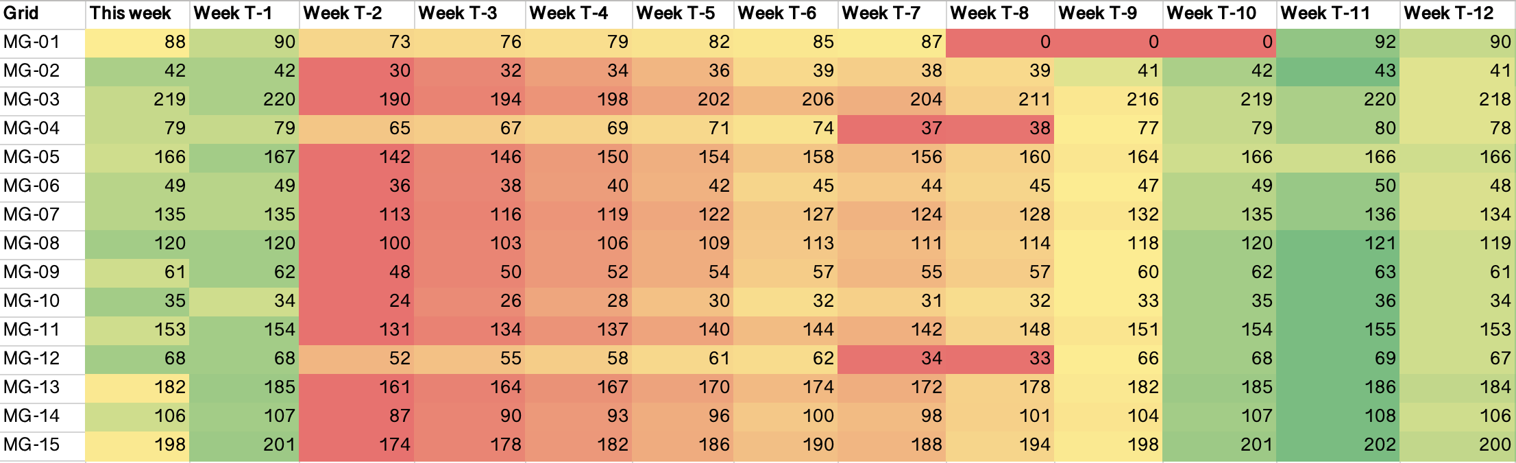
The heatmap colouring can be applied in two ways. Row-based colouring is useful to highlight changes within a single mini-grid over time. This is useful for metrics like, for example, active customers or energy consumption. Global colouring across the entire sheet makes it easier to compare a metric between mini-grids. The example in the figure is coloured per row, to put the emphasis on how the energy consumption metric fluctuates over time for a mini-grid. It is true that you would still see within-row colour differences if the sheet is coloured globally, but it would primarily highlight consumption differences between mini-grids, which is driven largely by different installed photovoltaic (PV) capacities, rather than mini-grid performance. Small sites would then appear red, larger ones green, which makes it harder to spot issues across the portfolio. It is also possible to do the colouring based on targets that are set internally, rather than relative to historical datapoints.
Naturally, green colours indicate a desirable direction for the metric (e.g., high values for active customers or consumption, low values for things like technical losses), while red indicates that the metric is at a low point. It is a pointer towards sites that might require operational resources.
From the energy consumption heatmap (Figure 4), several typical events become immediately visible:
-
Observation 1 - A mini-grid that is completely offline:
Mini-grid 1 (MG-01, first row) during weeks T-8 to T-10 illustrates what a full system shutdown would appear as. Energy consumption drops to zero and the cells turn red, calling for operator action. In addition to showing that the mini-grid is offline, it also shows the daily energy sales lost due to downtime, providing valuable input for prioritising outstanding issues. -
Observation 2 - A mini-grid operating at reduced capacity:
MG-04 and MG-12 indicate reduced energy consumption in weeks T-7 and T-8. Such a pattern suggests a fault in a portion of the system. It could originate from a variety of causes, for instance a failure in one of the distribution grid branches, the loss of a battery inverter, or failure of a portion of the energy generation system. -
Observation 3 - Gradual performance degradation over the portfolio:
In dusty environments, insufficient panel cleaning can result in a slow, steady decline in energy production. While less obvious than sudden failures, the trend appears as a gradual colour shift over several weeks, see an example in columns week T-5 to week T-2. The effect is slightly exaggerated in the heatmap to illustrate what a gradual decline would look like. In practice, operational teams would typically detect and (hopefully!) respond to such dynamics well within four weeks.
Example 2 - Heatmap for Energy Losses
Just as the previous section highlighted a heatmap for energy consumption, similar heatmaps can be generated for other metrics, each revealing different aspects of mini-grid performance. An energy losses (%) metric could be defined to represent the proportion of energy fed into the distribution grid that is not sold. It can be calculated as shown in Equation 1:
This calculation inherently includes distribution losses, so some energy losses will always appear. In a heatmap, the result could look as shown below in Figure 5.
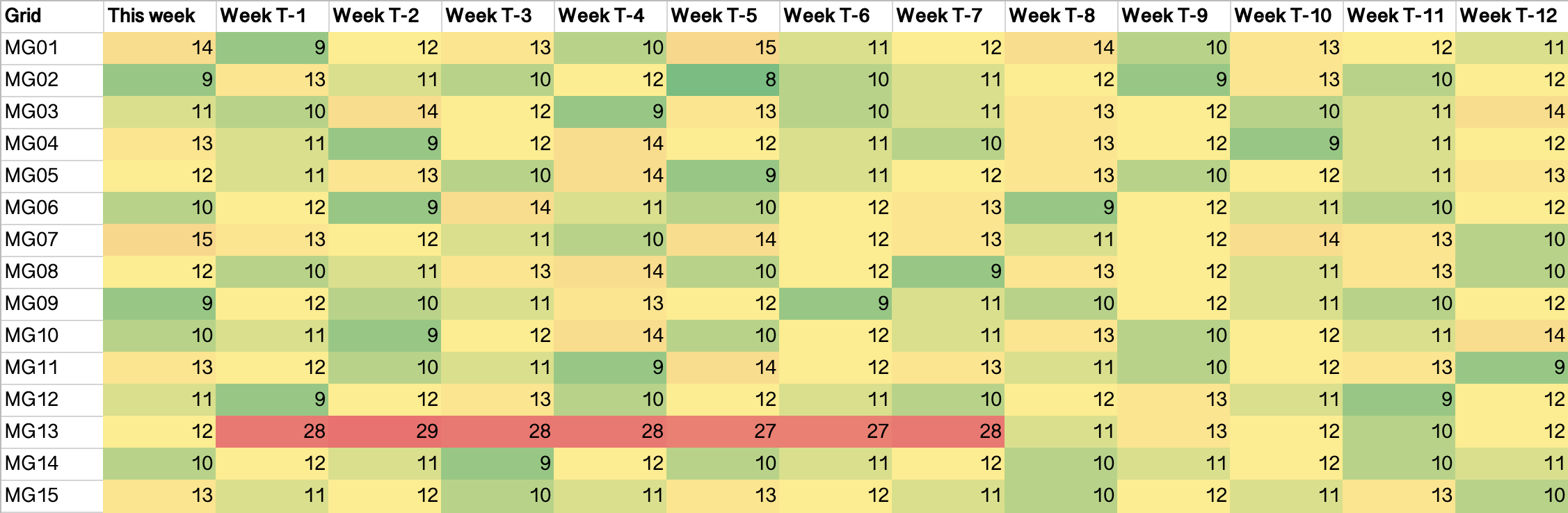
The expected distribution losses can be accounted for by subtracting an estimate – derived from energy flows and grid length – so that only the unexpected losses remain.
-
Observation 4 - Excessive energy losses:
MG-13 shows consistently elevated losses from weeks T-1 to T-7. An operational team would be dispatched to diagnose and resolve the issue. Losses return to ‘normal’ in the latest week of the map.
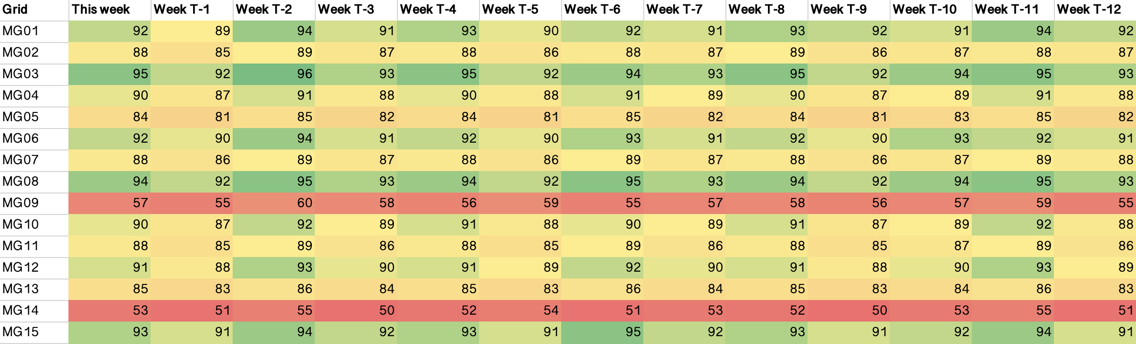
Example 3 - Heatmap for Capacity Utilisation
The Capacity Utilisation metric compares energy sold, on the one hand, to the theoretically available energy for sales on the other. Mathematically, it is expressed as Equation 2:
In this equation, the Energy Sold is the consumption as measured at the customer smart-meters (in kWh). The Theoretical Available Energy for sales (also in kWh) is computed with Equation 3:
Where here the Installed PV Capacity is the site capacity (in kWp) and the Specific Power Output is the estimated energy yield per kWp installed, per day (daily kWh/kWp installed), typically in the 3.5 - 4.5 range for a typical mini-grid on the African continent. The seasonal variation of this number should, and can be quite easily, taken into account through data in simulation tools like PVSyst, or open source resources such as Global Solar Atlas or PVGIS. The Powerhouse Losses and Distribution Losses can be estimated through equipment datasheets. The resulting Capacity Utilisation from Eq. 1 is then also an estimate, but accurate enough for a practical application. Presented in a heatmap it can highlight sites operating below their potential (Figure 6).
-
Observation 5 - Mini-grids that are operating below their potential:
The heatmap highlights which sites are operating below capacity. In the example, MG-09 and MG-14 stand out negatively for capacity utilisations in the 50-60% range. This view can trigger operational teams to explore the further introduction productive use of energy (PUE) equipment, such as freezers, electric mills or electric bikes, into the community to stimulate energy consumption. Alternatively, teams could investigate integrating digital loads (e.g., cryptocurrency mining or micro data centres) into the mini-grid system to monetise excess energy.
Heatmaps for Other Metrics
Beyond the examples above, heatmaps of other metrics can reveal additional insights. A few more examples:
-
Active Customers:
A heatmap of active customers makes it possible to identify clusters of customers going offline within a mini-grid. It functions similarly to Observation 1 (energy consumption) above, but is slightly more sensitive: total grid consumption may remain stable even if 10–20 individual customers are disconnected. -
Revenues:
A heatmap for portfolio revenues can be useful. Understanding relative earnings between sites is important for prioritising the backlog of operational issues. -
PUE performance:
Displaying PUE-related metrics, such as the collection of equipment leasing fees or electric bike battery swaps, in a heatmap can highlight underperforming PUE programs. This supports more targeted commercial and operational decisions around increasing PUE adoption in communities.
Implementing Heatmaps in Your Organisation
Heatmaps should be relatively straightforward for most operators to make. In their most simple form, they can be a simple, coloured, excel sheet built from processed data. The key prerequisite is a functioning data pipeline - from customer smart-meter to a central data warehouse - which, although not always easy to create and maintain, every operator has in some shape or form. We may define increasingly advanced levels of implementation:
-
Basic implementation:
A basic script that takes an extract from the data warehouse and generates the heatmaps. At this level, the output may simply be a colour-coded Excel file, reviewed manually. -
Intermediate implementation:
Automated generation of heatmaps, embedded within the operator’s digital ecosystem (dashboards or internal tools). -
Advanced implementation:
Automated heatmaps combined with alerts that flag notable changes in key metrics from one day or week to the next. Operating teams are then immediately notified in case of anomalies.
Operators could aim to embed the use of heatmaps directly into their operational routines, using them to establish a continuous feedback loop between data and action. By using heatmaps, interpreting metrics is reduced to reading colour cues: green indicates (relative) optimal performance, red signals issues, and gradients reveal trends over time.
Conclusion
The way we present energy access data matters a great deal in the ability of operational teams to use them effectively. Current visualisations typically focus on portfolio aggregates, between-site comparisons, or views of metrics over time for singular, or a small number of, grids. While these provide a level of insight, they do not make it immediately clear where attention is most urgently required across the portfolio, particularly to those with lower graphical literacy levels. Effective operations at scale requires a portfolio view that is actionable at a glance for all stakeholders.
Heatmaps build on data that most mini-grid operators are already collecting. They are an intuitive way to take the pulse of a mini-grid portfolio (or any set of distributed energy assets) by condensing operational data into a single, actionable view. Their use enables teams to spot a wide range of operational events such as outages, partial outages, performance decline, underused capacity, excessive energy losses, and much more, in a single view and without the need for advanced interpretation. It equips teams to quickly assess the health of their portfolio and allows them to prioritise their actions more effectively.
While operational excellence requires a great deal more than just new data visualisations, heatmaps can be a building block step to operational success. In a context where site performance is crucial to the economics of mini-grids, and where O&M resources are limited, updating our data visualisations is an easy way to support development of more capable operators. With that we create more resilient businesses that bring us a step closer to universal electricity access.
References
- [1] S. L. Franconeri, L. M. Padilla, P. Shah, J. M. Zacks, and J. Hullman, “The science of visual data communication: What works,” Psychological Science in the Public Interest, vol. 22, no. 3, pp. 110–161, Dec. 2021. doi:10.1177/15291006211051956.
I welcome your thoughts and feedback, feel free to reach out.